JPEG compression and retina displays
There’s an article here which describes a method for providing higher-resolution images to users with high-resolution displays. It seems like a bit of a free lunch to be able to suddenly get much better quality like that, so I ran some tests of my own with a really hacky ruby script that calls gm convert and gm compare, and got somewhat different, less positive results.
I took four PNG images of 1000x1000 px each, and for each one, and each quality setting \(q\) produced two images:
a JPEG saved at quality \(q\) from a 50% scaled version of the original image (i.e., sending a JPEG at 1x resolution);
a PNG which is a 50% scaled copy of a JPEG saved at quality \(q/2\) (i.e., sending a JPEG at 2x resolution and half the quality, and then downscaling it in the browser).
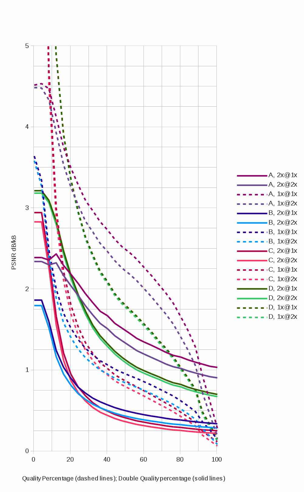
The script then computes the PSNR of the compressed images against both the original image and a half-scaled version, to model the quality against both 1x and 2x dpi versions, and divides by the size of the compressed file (click to embiggen):
I’m not totally sure that this is the “right graph” – I don’t know that PSNR is the best metric, or whether there are better ones, or whether any metric at all can match subjective perception, but it seems to indicate that lossier compression of larger images is only better in terms of quality per kilobyte at the top of the quality range, above 90%.
I don’t really understand how JPEG works, but it seems like compressing and then shrinking should be similar to shrinking and then compressing, since generally speaking JPEG compression takes an image, transforms it into the frequency domain, and then chops off data based on psychometric criteria.
So (to me, anyways), it seems intuitive that you should be able to get roughly the same quality by taking a lower-resolution frequency sample from a larger source image, but the quality setting doesn’t seem to quite work that way. It also seems very unintuitive that there would be a free lunch of the kind in the source article. Learning how JPEG works is on my to-do list – it’d be nice to explore this resolution/quality tradeoff mathematically rather than experimentally.
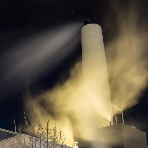
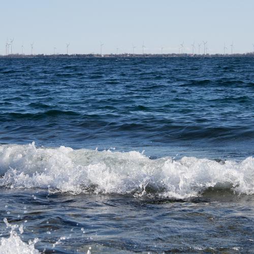
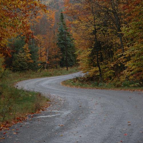
These are the images A, B, C, and D:
